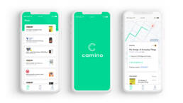
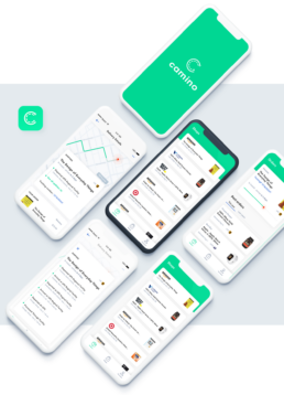
Camino
Camino automatically tracks all of your online orders in one place. It follows your package’s journey with a live interactive map and notifications every step of the way.
December 19, 2019 | UX/UI
The Challenge:
Design an app-based solution to better track packages and notify users with on live updates of their packages journey from beginning to end.
All of us had personal experiences in this situation – we order a package, and it takes longer to arrive than anticipated, which impressed the importance of designing something practical, usable, and straightforward.
The project
Design an intuitive mobile app for tracking packages. The interphase should easily illustrate the user’s package journey from beginning to end, also, to use the on-time notification and map tracking capabilities.
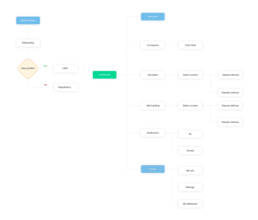
User flow
Before we started any research, we mapped out the user’s journey. My goal here is to highlight on a very BASIC level what’s the most straightforward path the user would have to take to track down their order.
Competitive Research
I studied a few delivery trackers in the industries to identify patterns and features their offerings to users. UPS and USPS have trackers that users can use to pinpoint a time of the delivery and overall journey.
- They used maps to illustrate to show the entire journey.
- Strong hierarchy
- Busy interphases, overwhelm with content.
- These trackers are web-based with mobile adaptations.
- Tracking packages are somewhat complicated users would have to complete a series of steps before entering and track a specific package.
Site map illustrates the entire user flow.
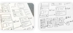
Sketches
After doing my initial research, I sketch ideas. It supports many leading iterations through varying design options.
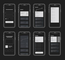
Wireframes
User Testing: Round 1
Using invisionapp.com and usertesting.com, I launched a small test using a wireframe prototype to identify what our user’s needs are.
Feedback
- Love the clean interphase, easy to track packages.
- They appreciate the package overview features.
- Map features seems a bit confusing
- Some users seem to get stuck after selecting the full journey view.
6
Usability Test
40
Confused
96%
Track package successfully
Pivoting
Once I identify the user’s needs, I revisit previous work and create new mocks using Sketch. I also removed unnecessary UI elements (while keeping the ones that matter), simplifying the user experience, and worked on visual elements and content that would convey trust and authority, setting us as the experts in the field.
Now, we want to test the newest version with the latest mocks containing the new element.
Low fidelity wireframes before starting on the visuals
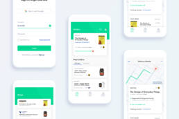
Interface exploration
User Testing: Round 2
Using invisionapp.com and usertesting.com, we are validating ideas, and testing if we improved comprehension and user experience around the tracker.
Feedback
- Map UI complements the overall experiences.
- Users were able to navigate back from the full journey view.
- Relevant information was easily accessible.
- Some users found it hard to use the notification feature.
5
Usability Tests
82%
Understood interphase flow
98%
Satisfy with user flow
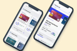
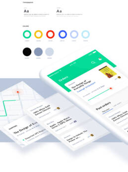
UI Design
After collecting all the user testing information, I began designing the final screens in Sketch. Using the there existing guidelines, we build multiple components to ensure design consistency throughout all filters.
Next Steps
- Present final mockups to stakeholders
- Asure alignment between goals and final designs.
- Tackle any concerns from a business standpoint.
- Meeting with engineers
- Document design specifics and ensure understanding of deliverables.
- Handoff to the development team via Zeplin
You reach the end of this project.
Thanks for watching! Please keep browsing to watch other similar projects.